Yamaha
Supply Chain and Procurement Software
Lead UI Designer
UI-UX
Dashboard Design
Year 2023

The Challenge
Complex User Flow: The primary issues included cluttered layouts, inconsistent visual hierarchy, and cumbersome navigation, leading to suboptimal user experience for procurement teams.
Outdated UI Design: Yamaha's supply chain software had an outdated interface that lacked intuitiveness and efficiency.
Limited Visual Hierarchy: Critical information was not highlighted effectively, making decision-making cumbersome.
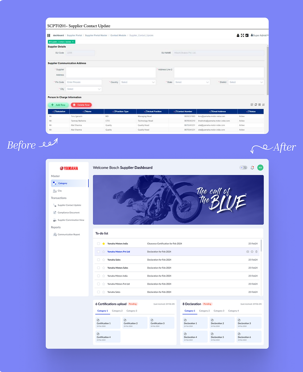
The Solution
Enhanced Information Architecture: Enhancing navigation through clear segmentation of information, ensuring users could quickly locate and update supplier details and contact information.
Modern Visual Design: Streamlining the interface with a clean and modern design on Figma, incorporating Yamaha’s brand identity.
Interactive Elements: Introduced intuitive interactions such as hover states, clear call-to-action buttons, and contextual pop-ups to guide user actions seamlessly.

Integrated interactive buttons like "Add Row" and "Delete Row" for managing contact lists efficiently, reducing redundant actions.

Organized information into collapsible sections, allowing users to focus on relevant data without feeling overwhelmed.
40% improvement in task completion time
Reduced user error rates by 25%
Sleek UI increased productivity & efficiency
